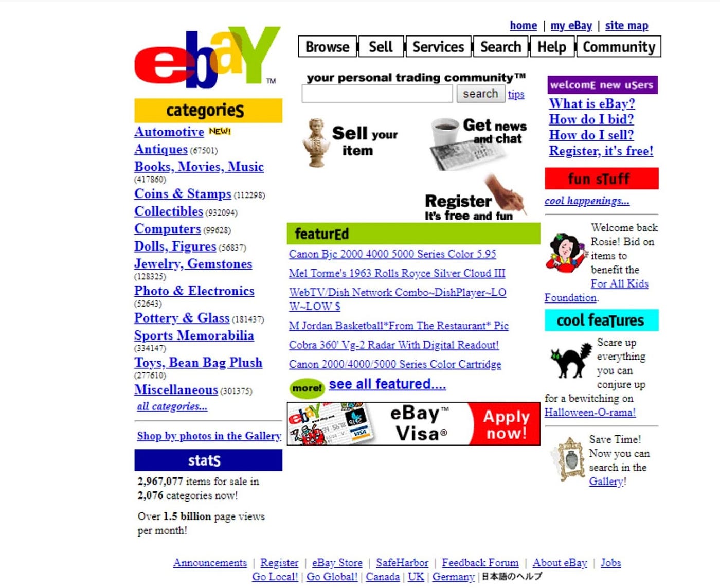
How To Make Your Site Look Like The Old Web
If you're reading this, it's because you have an interest in the old net (or you stumbled your way here by accident). You might be wondering "How do I make my website look super old!?" Well, Crackworth has the answer for you! This page is dedicated to teaching you the ways of web 1.0!
Learn HTML
First and foremost when making an old web site, learn to code with HTML yourself! It isn't that hard, anyone can pick it up within a week (or even a few days) if they really try. Stay away from modern website builders like Wix, since they're designed with modern web standards in mind. Trying to make an old looking website on one of those modern website builders just looks fake.
If you can't host your own site, use something like Neocities. You'll get a free webpage that can only be built with HTML and CSS, which will look waaaaaay more authentic. Speaking of CSS...
NO CSS!
To make a website look old, DON'T USE CSS!!!!!! Only use CSS if it's ABSOLUTELY NECESSARY!!!!
The old web, especially in regards to personal pages, had little to no CSS at all! CSS is mainly used as a way to keep things clean and slick, and to keep HTML out of the process of making things look nice. Basically, nowadays, HTML is the skeleton and CSS is the flesh. When you're making sites for the old web, HTML will be the skeleton and the flesh!Use Deprecated HTML Tags and Attributes
Deprecated HTML tags are tags that are no longer used, aren't encouraged for use, or are unsupported by modern browsers. These include < center >, < font >, < u >, and < marquee >, among others. This also includes attributes such as bgcolor, height, width, align, and others. These tags and attributes were deprecated and replaced by CSS equivalents. As states before, DON'T USE CSS!!! Make good use of these deprecated tags and attributes, since that's what was used back then!
Use Tables
To make multiple things appear on one line, back in the day, tables were used. The whole web back then was essentially comprised of tables, but nowadays that has been dropped with new web standards. Use tables!
Every Picture is a GIF
For pictures, make almost everything a GIF file. GIF files do not have to be moving pictures, as many today associate GIFs with, they're just really good at compressing file sizes. Back when space was limited, people used GIF files to save on computer storage, which also gave the old web that peculiar pixelated look that we love so much.
Repeating Backgrounds
If you take a good look at lots of old webpages, especially if they were personal, they usually have a repeating background. Use repeating backgrounds!
If that's not your fancy: Consider going with an old modern web design. Take inspiration from old websites owned by companies, as those were the modern sites of the past.
Use Wild Colours and Layouts
Part of the magic of the old web is just how wacky, garish, and wild pages got. Be creative! Feel free to use a wide range of colours and layouts for your page. Nowadays, everything's too sterile and clean!
Use and Design with a Low Resolution
Consider lowering your monitor's resolution all the way down to 800x600 or something slightly above. Back when that was the norm, web pages were built around that resolution. Switch to a low resolution to get a good idea of what your site would look like on an old monitor, this will help with how authentic your page looks.
Neocities Tips
This is specifically aimed at Neocities, but can apply to any web builder. Neocities only gives you 1 GB of memory on its free plan, so to save up on alloted space, consider uploading your image files elsewhere, like Imgur or ImgBB, and keep only HTML files here.
Examples of The Old Web:


If this page helped you out, consider giving me a shoutout on your own site ;)
Feel free to send me your creations, if you really want to.
Back
Last Updated: May 10, 2024
Page Created: February 20, 2024